Written by Hailun (Marco) Feng
With the proliferation of mobile devices and the number of mobile searches, on July 1, 2019, Google launched mobile-first indexing, which continues to roll out until today and will change how sites get ranked on the SERPs (the search engine results pages).
To start with, what is mobile-first indexing? Most search marketers know that Google crawls the internet as a bot and surfs around like a real visitor, adding pages to its index. However, with the advance of mobile-first indexing, Google not only visits your website as a desktop user but also as a mobile user. Due to this shift, your site may be presented differently on desktop than mobile devices. For instance, some links on the desktop might not appear on the mobile version, which is a problem as the Google bot will not trace links that are not there, thus interrupting the flow of page equity.
Content under a "read more" link used to be not indexable by Google, but with the advent of mobile-first indexing, content hidden in tabs and accordions will have the same weight as content displayed on the page. This makes perfect sense for mobile users since the texts might not be shown completely on a tiny phone or tablet screen. In addition to design, information should be presented to better serve the intent of mobile users. SEMRush is a great tool to identify topics with intents that are different on desktop versus mobile devices. For instance, MarcoFeng.com and many publishers now have "direction" links added to addresses on their best-ofs, which direct users to Google Maps and show routes to venues they are interested in from their current locations.
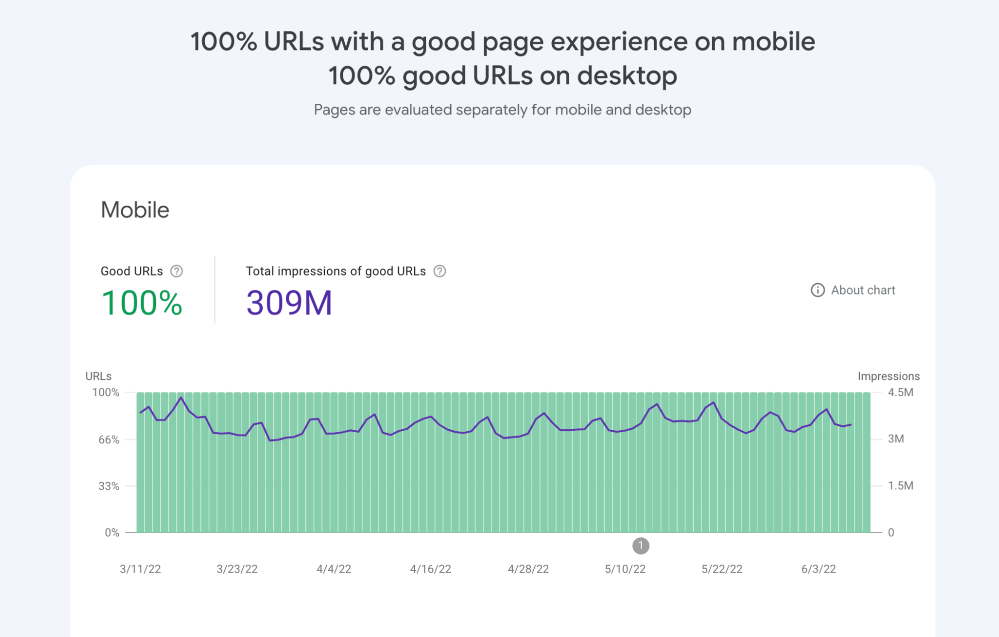
With the promising future of mobile-first indexing, is there any need for the desktop index? The answer is no. Currently, Google is running both indexes, and some users will see results from the mobile index, while others will see results from the desktop index. Eventually, Google will slow down the desktop index and phase it out when the company feels more confident with the mobile index. In conjunction with mobile-first indexing, Core Web Vitals, released earlier last year, are three metrics that score a user's experience on a webpage. They measure how quickly page content loads, how quickly a browser loading a webpage can respond to a user's input, and how unstable the content is as it loads in the browser.
What if you do not have a responsive website? The Googlebot can still index the desktop version of your site, even though it is using a mobile user agent. But, anyone serious about making a statement online needs a website that adapts to a mobile platform. The good news is that most content management systems today allow you to create responsive design effortlessly, even if you don't know how to code.
Besides creating a responsive experience, search marketers should know that optimizing content, investing in original assets, and building and maintaining brand reputation still matter for your organic performance. While this sounds like a lot of work, it does pay off. And that's how MarcoFeng.com grew to be one of the top travel sites, with more than 1.5 million readers annually, answering over 60,000 questions on travel, food, and crafts.
Hailun (Marco) Feng
https://www.marcofeng.com
marcofeng0128@gmail.com